COLOR, CONDUITS, & CONNECTIVITY
Sharon Arnold
June 2019
It was a warm sunny day in March of 2018, and I was enjoying a walk from Fort Greene to Paolo Arao’s studio in Bed Stuy, Brooklyn. There, I was to meet with him and Sue Danielson, who had curated a group show of New York-based painters at Bridge Productions that January. Paolo had been among them, and this visit was a way to connect and continue building upon the initial thread of the exhibition. The show, Somewhere Nearby, was a tender gathering of artists revealing the presence of a bi-coastal community that had formed through social media. As I walked, I thought about how I was here stepping into physical space to complete the connection. In a funny way, the map of New York City only becomes clear from traversing its expanse on foot. The mysterious underground topography of subway lines belie the closeness of the city’s near and adjacent neighborhoods. Still, the train is a conduit, a literal connection between a place that is otherwise unreachable there, and here. The railroad as we know it is often considered, in retrospect, a harbinger of the internet; appearing just before the telegraph. These were the precursors of our ever-shrinking global community, a physical mainframe bridging distance through a network of intersecting lines. And here we were, connected through art, the internet, and railways.
When I arrived, the warm familiarity of this large industrial space flooded me with the smell of old wood and metal, a hundred layers of paint, and the presence of people working across time in a space imbued with the bustle, movement, and energy of bodies. I walked down the hallway to arrive at a bright, compact, and color-filled studio. In the corner stood a tall stack of neatly folded, brightly hued fabric. On the floor was a large irregular piece of raw canvas, a drop cloth, which I learned later would be incorporated into Paolo’s work at the time. The history of fabric has a relationship to the history of railways, and this building, in how far this material has traveled, and how it’s imbued with the stories of those who’ve touched or worn it. Imprinted on the fabric was its use across time, each interaction, those who stood upon or walked across it, leaving an impression of their footsteps. Paolo’s presence, movement, and energy would become a part of the textile’s life history as well, as the marks he inadvertently made through his own footsteps or dripping paint became a part of the material’s memory. That morning, the work on the wall of Paolo’s studio included a few new pieces in which Paolo had sewn material together to create abstractions in patchwork. While no longer using quite as much of the canvas drop cloth, this method of composing with sewn, colorful fabric and canvas has become the main focus of Paolo’s work today.
When I arrived, the warm familiarity of this large industrial space flooded me with the smell of old wood and metal, a hundred layers of paint, and the presence of people working across time in a space imbued with the bustle, movement, and energy of bodies. I walked down the hallway to arrive at a bright, compact, and color-filled studio. In the corner stood a tall stack of neatly folded, brightly hued fabric. On the floor was a large irregular piece of raw canvas, a drop cloth, which I learned later would be incorporated into Paolo’s work at the time. The history of fabric has a relationship to the history of railways, and this building, in how far this material has traveled, and how it’s imbued with the stories of those who’ve touched or worn it. Imprinted on the fabric was its use across time, each interaction, those who stood upon or walked across it, leaving an impression of their footsteps. Paolo’s presence, movement, and energy would become a part of the textile’s life history as well, as the marks he inadvertently made through his own footsteps or dripping paint became a part of the material’s memory. That morning, the work on the wall of Paolo’s studio included a few new pieces in which Paolo had sewn material together to create abstractions in patchwork. While no longer using quite as much of the canvas drop cloth, this method of composing with sewn, colorful fabric and canvas has become the main focus of Paolo’s work today.
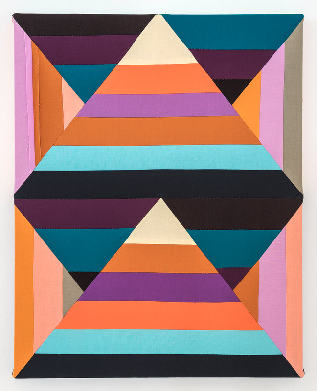
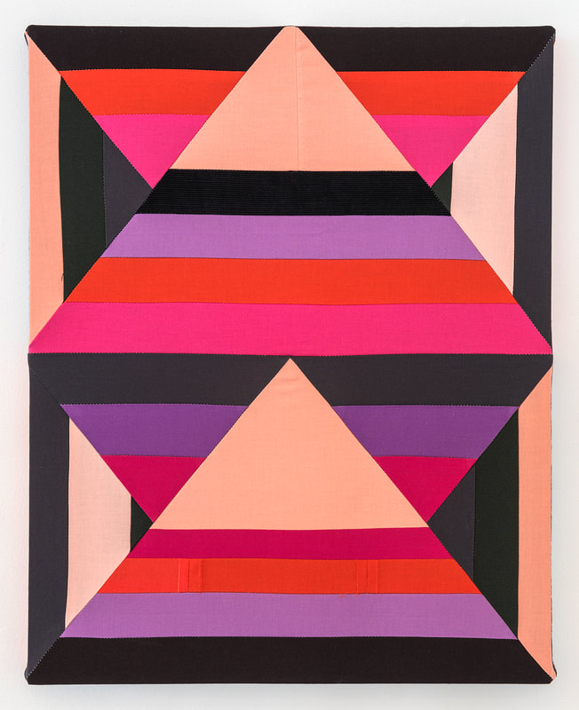
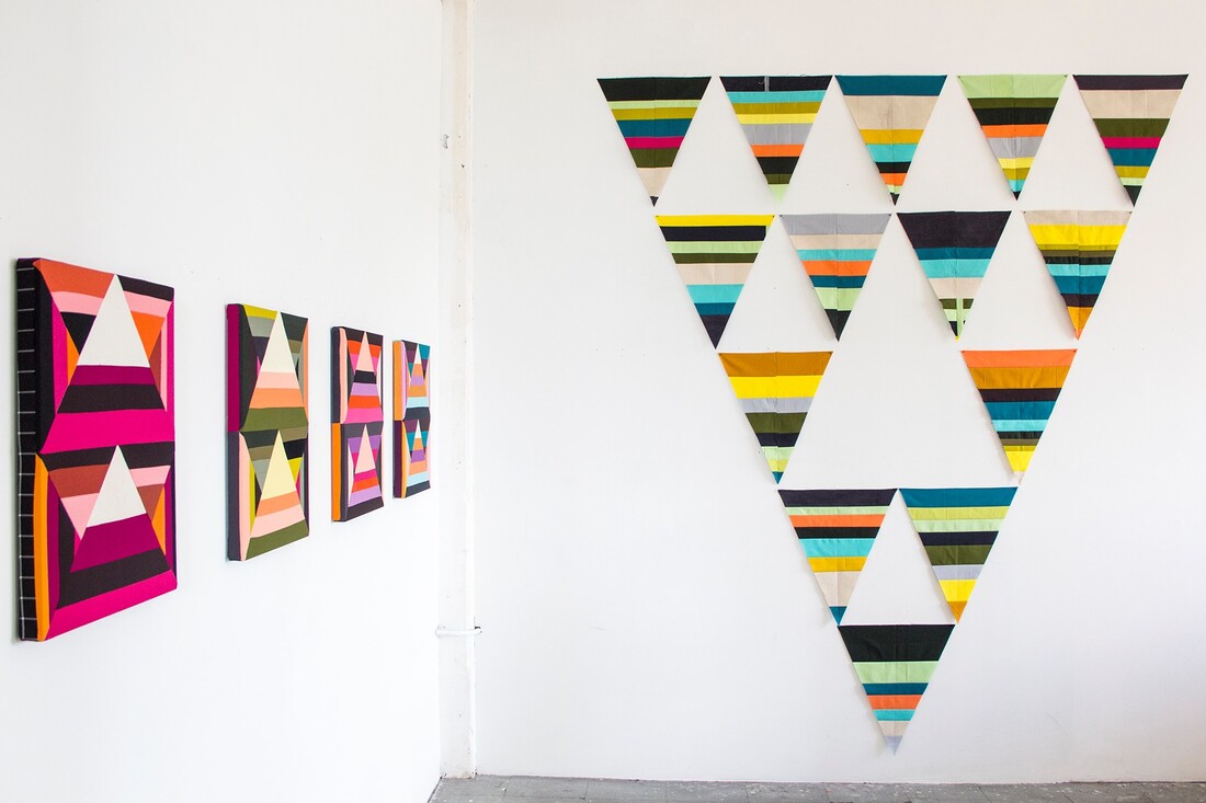
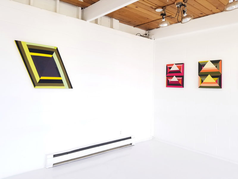
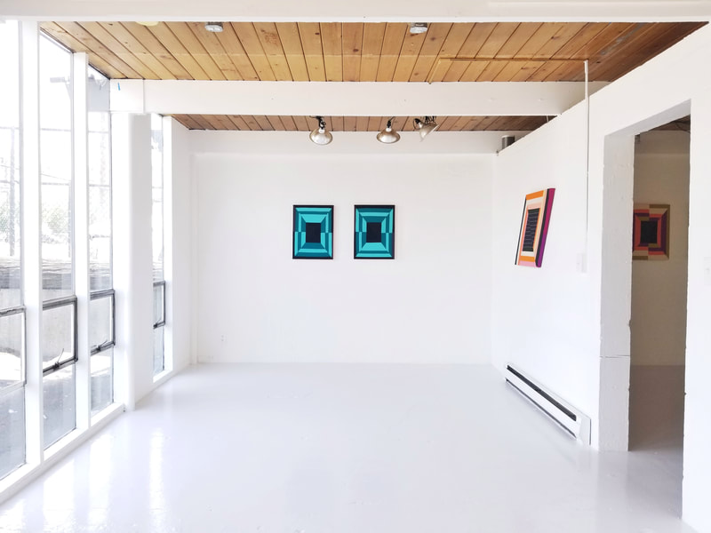
In Key Change, Paolo is bringing us four distinct groups of work that stand alone, but ultimately work together in their entirety as an installation. The throughline between them is the way he uses patterning, and particularly triangles, as a foundation for his composition. They include a series of shaped parallelograms, leaning forward as if moving at high speed; a series of sewn diptychs he refers to as “same-sex” paintings, mirroring each other with slight variances; a set of intricately striped rectilinear paintings; and a large textile construction of triangular pieces. These are each a direct reference to their lineage in Modernist expression, hard-edged painting, and post-painterly abstraction. The tactility of the sewn pieces resists flatness— the stitches and folded corners become an accumulation of texture against a field of colorforms, another pattern. A new addition to the work in this exhibition is the use of corduroy and denim, further connecting the history of the fabric to the body, similar to how the material would appear in a quilt. These new textures assert a sculptural presence speaking to both their painting-ness and object-ness; their past and their present; their dual lives. Paolo speaks to the way he relies on chance through errors in sewing, creating inevitable imperfections. In enabling uncertainty, and releasing expectation, he thwarts an imposed straightness of the line, thus queering the composition by allowing a wandering seam; or mending, repairing, and bringing together things we wouldn’t ordinarily predict to adhere or appear side by side. An unexpected tenderness towards our attention to storytelling, uncommon to ordinary formalism, comes forward.
The political symbolism of both quilts and flags, and the declarative nature of a banner as the bearer of a family crest or cultural emblem, is as personal as it is political, declaring identity. In the case of queer histories, these textile art forms have played a huge part in activism, rallying people around a cause, and representing community. The universally understood symbol of the Rainbow Flag was designed for just that purpose. In 1978, Harvey Milk commissioned artist, designer, and drag performer Gilbert Baker to create the Rainbow Flag for the San Francisco Pride parade. Taking note of the display of pageantry present in the recent 1976 Bicentennial celebration of the US, Baker created this colorful icon as a way to represent the gay community through a more inclusive, broad-spectrum symbol than the familiar, pink triangle. In 2019, we have an even wider range of flags to represent a full array of queer identity, including a pastel hued flag for the trans community, and a revised Rainbow Flag with black and brown stripes to represent the BIPOC queer community. The multiplicity of banners continues to expand, bearing a growing number of family crests.
Paolo deftly combines the legacy of the rainbow flag and the triangle together in his work, celebrating shape, form, color, and multiplicity. Triangles appear everywhere, but in particular, Birds in Flight is built from multiple smaller pieces that construct a larger pennant. Its use of bright hues and tessellation defies restriction; a resistance to systemic and dismissive colonial definitions of gender, race, sexuality, symbolism, craft, and cultural context. Creativity is a method to navigate obstacles, to sprint ahead of mainstream culture to find a sense of freedom, flexibility, and movement in spite of society’s narrow definitions. Paolo is using this nimble maneuverability around color, material, and context as a tactic to elicit, prompt, and provoke a creative solution. The mistakes that occur are an artifact of this circumvention. Each notion of “right” and “wrong” becomes a query rather than a terminus. They are steps towards another outcome that would have been unavailable had the door been closed to chance. While Paolo speaks to putting himself in a “compositionally uncomfortable situation” while making the work, he also talks about not dwelling too long on a painting, important in the way that it’s important to not overthink things— to not overdictate the shape the work is meant to be. What doesn’t work for this piece, may work for the next, and in this way processes stack and leapfrog across a body of work to become a signature. While color and overall patterns or compositions may repeat themselves, their uniqueness is found in the materials, the stitch, the patchwork of each individual construction.
Paolo’s tender treatment stitches together multiple lineages and histories to create a new story of the present, of his lived experience, today. In describing his deeply rooted connection to the patterns and color found in textiles from the Philippines, as well as his awe and appreciation of Gee’s Bend and Amish quilts; he notes the way their color, composition, and construction evoke a strong visceral and emotional power. This invocation speaks to the syncretism of an aesthetic cultural memory from Filipino, African, and Amish patterning passed down through generations of people. Across the world, inherited cultural art forms include colorful patterned geometry in infinite combinations and compositions. Coded deeply within these works are histories, documentation of the lives of people, storytelling, and cultural signification. Creators weave in the lives of their families, their communities, and themselves. Paolo, working in this way, does the same: threading and sewing the stories of his life, his Filipino lineage and cultural heritage, and his queer and artistic communities to form a larger whole.
The bright hyperchromatic hues of Key Change pop in the light-filled space of Glass Box Gallery. The interplay of color isn’t confined within a single piece, but charges the entire space with its presence, enveloping us in the process. As participants in the experiences Paolo creates, we get to feel his tender attention to histories, lineages, and inquiry come through in passionate color and delight. He gives us an opportunity to read and re-read the work in an unprescribed way, to see it fully. The breadth of materials, colors, shapes, and rhythm simultaneously intersect, converge, and unravel like railways to connect the distance across space and time of craft, culture, lineage, and stories. Like people, they interact and impact on an emotional level. Like people, they are asymmetrical, dynamic, off-center, askew; sewn up and mended, and lovingly gathered. Bringing us together through the work, Paolo’s geometry connects us to him, and to each other.
The bright hyperchromatic hues of Key Change pop in the light-filled space of Glass Box Gallery. The interplay of color isn’t confined within a single piece, but charges the entire space with its presence, enveloping us in the process. As participants in the experiences Paolo creates, we get to feel his tender attention to histories, lineages, and inquiry come through in passionate color and delight. He gives us an opportunity to read and re-read the work in an unprescribed way, to see it fully. The breadth of materials, colors, shapes, and rhythm simultaneously intersect, converge, and unravel like railways to connect the distance across space and time of craft, culture, lineage, and stories. Like people, they interact and impact on an emotional level. Like people, they are asymmetrical, dynamic, off-center, askew; sewn up and mended, and lovingly gathered. Bringing us together through the work, Paolo’s geometry connects us to him, and to each other.
